In working with longitudinal student-level records, we regularly encounter data structured as multiway data. We explore that data visually using multiway dot plots as described by William Cleveland (1993, 302–6). Quotations, unless noted otherwise, are from this source.
Note that “multiway” in our context refers to the data structure and chart design defined by Cleveland.
This article in the MIDFIELD workflow:
- Planning
- Initial processing
- Blocs
- Groupings
- Metrics
- Displays
- Multiway charts
- Tables
Definitions
- multiway data
-
A data set of three variables: a category with \small m levels; a second independent category with \small n levels; and a quantitative variable (the response) of length \small m \times n such that there is a value of the response for each combination of levels of the two categorical variables.
- multiway chart
-
A multi-panel dot plot: horizontal, quantitative scales; rows that encode one category; and panels that encode the second category. All panels have identical axes. The ordering of the rows and panels is crucial to the perception of effects.
- multiway superposition
-
Multiway data can be extended to include a third category of \small p levels; the quantitative response has length \small m \times n \times p, one for each combination of levels of three categories; the rows and panels encode the first two categories as usual; \small p data markers encode the third category on each row. Clarity usually requires that \small p=2 but not more.
- stickiness
-
Program “stickiness” \small(S) is the ratio of the number of graduates of a program \small(N_g) to the number ever enrolled in the program \small(N_e).
Method
We start with the results data frame from the Case study: Results vignette, containing data from four engineering programs (Civil, Electrical, Industrial/Systems, and Mechanical Engineering) grouped by program, race/ethnicity, and sex. These data have been filtered for data sufficiency, degree seeking, and program, and graduates are filtered for timely completion.
We prepare the data for use as input to order_multiway()
and use the results to construct multiway charts ordered by category
median values and by category percentage values.
Reminder. midfielddata is for practice, not research.
Load data
Start. If you are writing your own script to follow along, we use these packages in this article:
Loads with midfieldr. Prepared data. View
data dictionary via ?study_results.
-
study_results(derived in Stickiness).
Initial processing
Initialize. Assign a working data frame.
# Working data frame
DT <- copy(study_results)
Filter. Human subject privacy is potentially at risk for
small populations even with anonymized observations. Therefore, before
tabulating or graphing the data for dissemination, we omit observations
with fewer than 10 graduates. The magnitude of the bound
(graduates >= 10) can vary depending on one’s data.
# Protecting privacy of small populations
DT <- DT[graduates >= 10]
Note. MIDFIELD research findings are regularly grouped by program, race/ethnicity, and sex. However, applied to the practice data these groupings produce several groups with totals below the threshold we impose to preserve anonymity, introducing a number of NA values in the resulting charts and tables. These NAs are largely an artifact of applying these groupings to practice data.
Preparing the categorical variables
Before we apply the order_multiway() function, we edit
the categorical variables to create the forms we want in the final
charts or tables.
Recode. The first multiway categorical variable is
program. To improve the readability of the charts, we
recode the program abbreviations.
# Recode for panel and row labels
DT[, program := fcase(
  program %like% "CE", "Civil",
  program %like% "EE", "Electrical",
  program %like% "ME", "Mechanical",
  program %like% "ISE", "Industrial/Systems"
)]
Create a variable. We combine race and
sex into a single categorical variable (denoted
people) as our second, independent categorical
variable.
# Create a new category
DT[, people := paste(race, sex)]
setcolorder(DT, c("program", "people", "race", "sex"))
DT
#>        program               people          race    sex ever_enrolled
#>         <char>               <char>        <char> <char>         <int>
#>  1:      Civil         Asian Female         Asian Female            15
#>  2:      Civil International Female International Female            23
#>  3:      Civil         White Female         White Female           263
#> ---
#> 27: Mechanical   International Male International   Male           178
#> 28: Mechanical   Other/Unknown Male Other/Unknown   Male            80
#> 29: Mechanical           White Male         White   Male          1596
#>     graduates stickiness
#>         <int>      <num>
#>  1:        10       66.7
#>  2:        13       56.5
#>  3:       162       61.6
#> ---
#> 27:        89       50.0
#> 28:        41       51.2
#> 29:       955       59.8
At this point, the multiway categories (programs and
people) are “character” class.
order_multiway()
Converts the categorical variables to factors ordered by the quantitative variable.
Arguments.
dframeData frame with multiway data in columns. Two additional numeric columns required when using the percentage ordering method.quantityName (in quotes) of the single multiway quantitative variable.categoriesVector of names (in quotes) of the two multiway categorical variables.method“median” (default) or “percent”, method of ordering the levels of the categories. Argument to be used by name.ratio_ofVector with the names (in quotes) of the numerator and denominator columns that produced the quantitative variable, required when using percentage ordering method. Argument to be used by name.
Equivalent usage. The following implementations yield identical results,
# Required arguments in order and explicitly named
x <- order_multiway(
  dframe = DT,
  quantity = "stickiness",
  categories = c("program", "people"),
  method = "median"
)

# Required arguments in order, but not named, method implicit
y <- order_multiway(DT, "stickiness", c("program", "people"))

# Demonstrate equivalence
check_equiv_frames(x, y)
#> [1] TRUE
Output. Adds two columns to the data frame containing the computed values that determine the ordering of factors. The column names and values depend on the ordering method:
method = "median"Yields medians of the quantitative variable grouped by the categorical variables.method = "percent"Yields percentages based on the same ratio that produces the quantitative variable but grouped by the categorical variables.
Median-ordered data
For this example, we select the count of graduates
(graduates) as our quantitative variable and use
order_multiway() to order the categories by median numbers
of graduates.
To minimize the number of columns in the printout, we select the three multiway variables and drop other columns.
# Select multiway variables when quantity is count
DT_count <- copy(DT)
# DT_count <- DT_count[, .(program, people, graduates)]
DT_count
#>        program               people          race    sex ever_enrolled
#>         <char>               <char>        <char> <char>         <int>
#>  1:      Civil         Asian Female         Asian Female            15
#>  2:      Civil International Female International Female            23
#>  3:      Civil         White Female         White Female           263
#> ---
#> 27: Mechanical   International Male International   Male           178
#> 28: Mechanical   Other/Unknown Male Other/Unknown   Male            80
#> 29: Mechanical           White Male         White   Male          1596
#>     graduates stickiness
#>         <int>      <num>
#>  1:        10       66.7
#>  2:        13       56.5
#>  3:       162       61.6
#> ---
#> 27:        89       50.0
#> 28:        41       51.2
#> 29:       955       59.8
Applying order_multiway(), we specify
"graduates" as the quantitative column,
"program" and "people" as the two categorical
columns, and "median" as the method of ordering levels.
# Convert categories to factors ordered by median
DT_count <- order_multiway(DT_count,
  quantity = "graduates",
  categories = c("program", "people"),
  method = "median"
)
DT_count
#>        program               people          race    sex ever_enrolled
#>         <fctr>               <fctr>        <char> <char>         <int>
#>  1:      Civil         Asian Female         Asian Female            15
#>  2:      Civil International Female International Female            23
#>  3:      Civil         White Female         White Female           263
#> ---
#> 27: Mechanical   International Male International   Male           178
#> 28: Mechanical   Other/Unknown Male Other/Unknown   Male            80
#> 29: Mechanical           White Male         White   Male          1596
#>     graduates stickiness program_median people_median
#>         <num>      <num>          <num>         <num>
#>  1:        10       66.7           28.0          10.0
#>  2:        13       56.5           28.0          12.0
#>  3:       162       61.6           28.0          95.0
#> ---
#> 27:        89       50.0           45.5          72.0
#> 28:        41       51.2           45.5          16.0
#> 29:       955       59.8           45.5         525.5
The function adds two columns (program_median and
people_median) to display the computed median values used
to order the factors. In the median method, the new column names are a
combination of the category variable names (from
categories) plus median.
For example, the results show that the median number of Civil Engineering graduates is 28 and that the median number of Asian Female graduates is 10. We confirm these results by computing the median values independently.
The following values agree with those in the
program_median variable above,
# Verify order_multiway() output
temp <- DT_count[, lapply(.SD, median), .SDcols = c("graduates"), by = c("program")]
temp
#>               program graduates
#>                <fctr>     <num>
#> 1:              Civil      28.0
#> 2:         Electrical      36.5
#> 3: Industrial/Systems      14.0
#> 4:         Mechanical      45.5
And the next result agrees with the values in
people_median.
# Verify order_multiway() output
temp <- DT_count[, lapply(.SD, median), .SDcols = c("graduates"), by = c("people")]
temp
#>                   people graduates
#>                   <fctr>     <num>
#>  1:         Asian Female      10.0
#>  2: International Female      12.0
#>  3:         White Female      95.0
#> ---
#>  7:   Other/Unknown Male      16.0
#>  8:           White Male     525.5
#>  9:           Black Male      18.0
Below we demonstrate that both categories are “factor” class:
program is a factor with 4 levels; people is a
factor with 9 levels; and neither is ordered alphabetically—ordering is
by increasing median value as expected.
# Verify first category is a factor
class(DT_count$program)
#> [1] "factor"
levels(DT_count$program)
#> [1] "Industrial/Systems" "Civil"              "Electrical"
#> [4] "Mechanical"

# Verify second category is a factor
class(DT_count$people)
#> [1] "factor"
levels(DT_count$people)
#> [1] "Asian Female"         "International Female" "Other/Unknown Male"
#> [4] "Black Male"           "Hispanic Male"        "Asian Male"
#> [7] "International Male"   "White Female"         "White Male"
Median-ordered charts
We use conventional ggplot2 functions to create the multiway graphs.
We create a set of axis labels and scale specifications for a series of median-ordered charts. We use a logarithmic scale in this case because the numbers span three orders of magnitude.
# Common x-scale and axis labels for median-ordered charts
common_scale_x_log10 <- scale_x_log10(
  limits = c(3, 1000),
  breaks = c(3, 10, 30, 100, 300, 1000),
  minor_breaks = c(seq(3, 10, 1), seq(20, 100, 10), seq(200, 1000, 100))
)
common_labs <- labs(
  x = "Number of graduates (log base 10 scale)",
  y = "",
  title = "Engineering graduates"
)
ref_line_color <- "gray60"
The first of two multiway charts encodes programs by rows
and people by panels. The as.table = FALSE
argument places rows and panels in “graphical order”, that is,
increasing from left to right and from bottom to top. The panel median
value is drawn as a vertical reference line in each panel.
# Two columns of panels
ggplot(DT_count, aes(x = graduates, y = program)) +
  facet_wrap(vars(people), ncol = 2, as.table = FALSE) +
  geom_vline(aes(xintercept = people_median), linetype = 2, color = ref_line_color) +
  common_scale_x_log10 +
  common_labs +
  geom_point()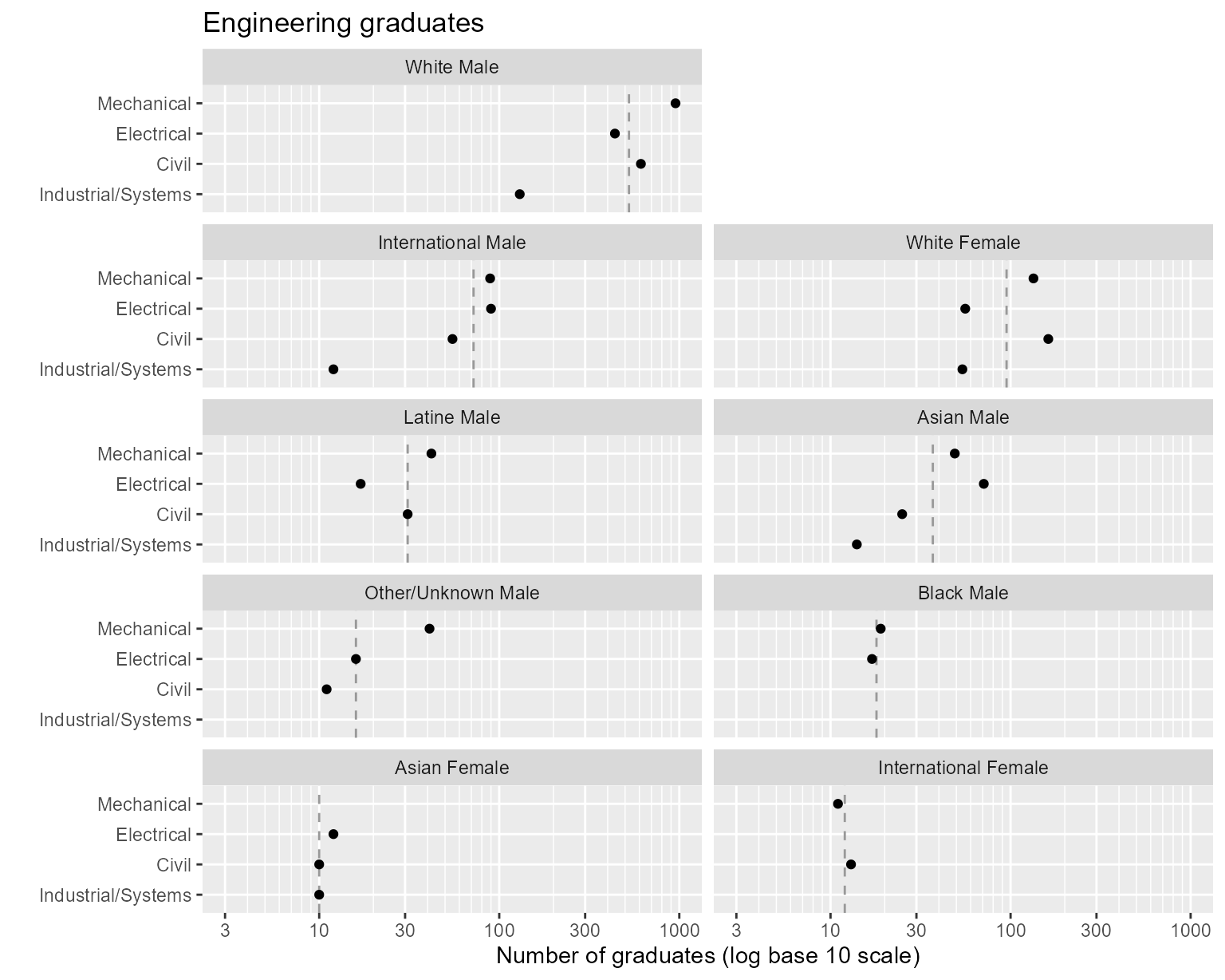
Figure 1. Rows and columns ordered by median values.
The programs are assigned to rows such that the program medians
increase from bottom to top. Industrial/Systems has the smallest median;
Mechanical Engineering the largest.
We drew the chart above in two columns to illustrate the graph order of panels. Asian Female students have the smallest median number of graduates, followed by International Female, Other/Unknown Male, Black Male, etc.
When space permits, however, laying out the panels in a single column can be useful for seeing effects. Here, we redraw the panels in one column.
# Programs encoded by rows
ggplot(DT_count, aes(x = graduates, y = program)) +
  facet_wrap(vars(people), ncol = 1, as.table = FALSE) +
  geom_vline(aes(xintercept = people_median), linetype = 2, color = ref_line_color) +
  common_scale_x_log10 +
  common_labs +
  geom_point()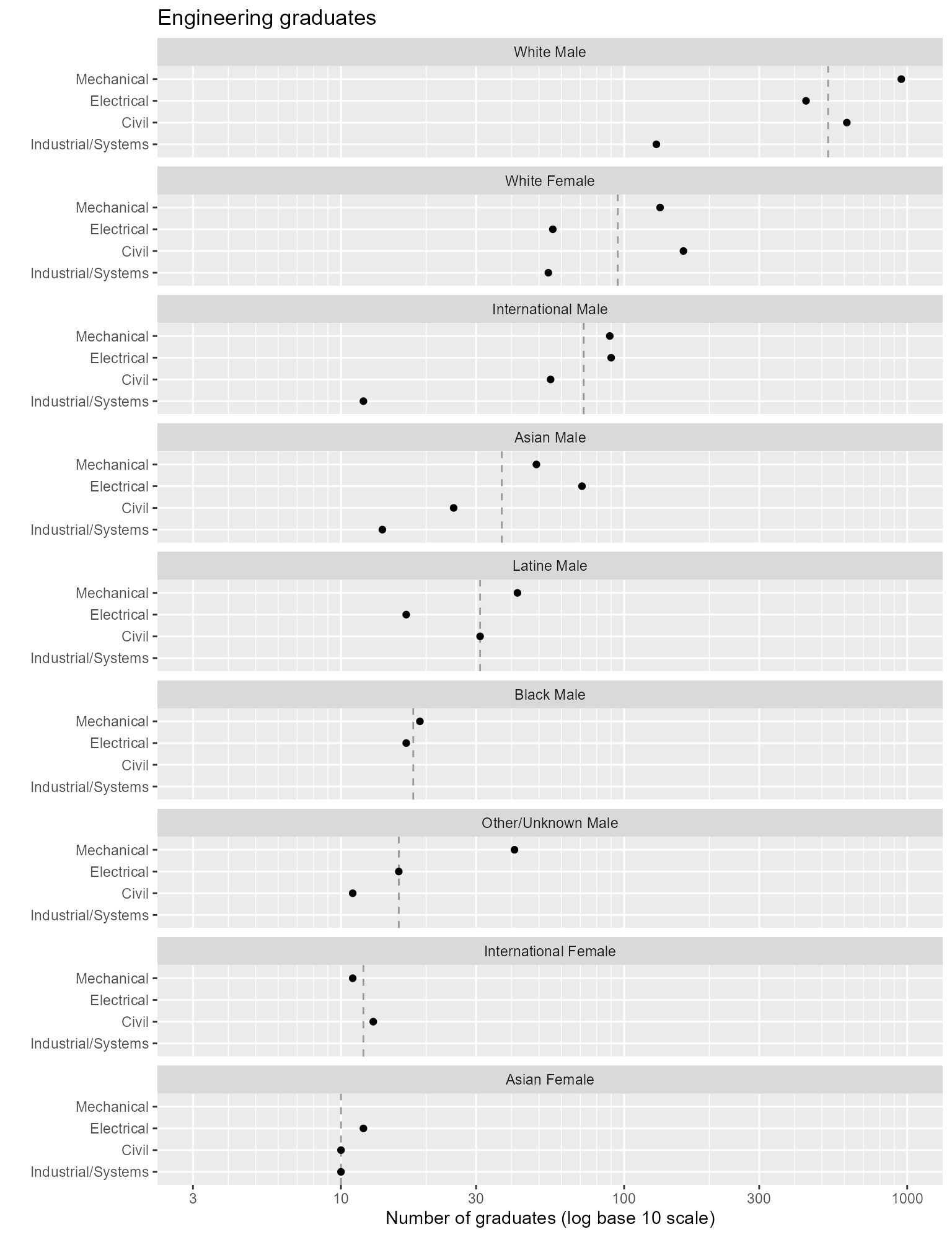
Figure 2. Redraw the panels in one column.
Reading a multiway graph
- We can more effectively compare values within a panel than between panels.
- Because rows are ordered, one expects a generally increasing trend within a panel. A response greater or smaller than expected creates a visual asymmetry. The interesting stories are often in these visual anomalies.
For example, the White Female panel shows a clear separation between two groupings of majors, Mechanical and Civil compared to Electrical and Industrial/Systems.
However, this chart does not permit us to effectively compare the eight values for a given program. For that we create a second multiway in which we switch the aesthetic roles of the categories—in this example by encoding people by rows and programs by panels.
# People encoded by rows
ggplot(DT_count, aes(x = graduates, y = people)) +
  facet_wrap(vars(program), ncol = 1, as.table = FALSE) +
  geom_vline(aes(xintercept = program_median), linetype = 2, color = ref_line_color) +
  common_scale_x_log10 +
  common_labs +
  geom_point()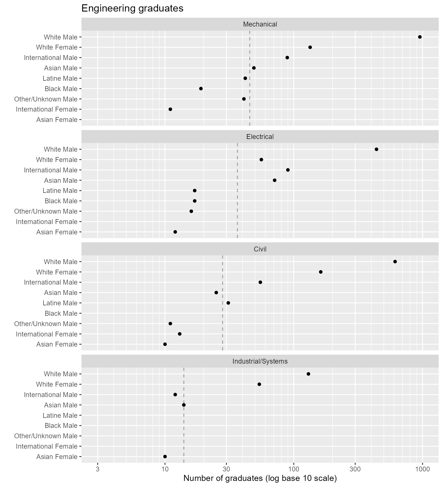
Figure 3. Switching the row and column assignments of categorical variables.
In this chart, the visual asymmetry that stands out most is
Electrical Engineering, White Female, low given their overall rank.
Avoid alphabetical order
In the next figure, the same data are plotted in alphabetical order, which reveals none of the effects seen in the previous chart. An ordering scheme based on the values of the quantitative variable is necessary if a multiway chart is to reveal how the response is affected by the categories.
# Create alphabetical ordering
DT_alpha <- copy(DT)
DT_alpha[, people := factor(people, levels = sort(unique(people), decreasing = TRUE))]

# People encoded by rows, alphabetically
ggplot(DT_alpha, aes(x = graduates, y = people)) +
  facet_wrap(vars(program), ncol = 1, as.table = TRUE) +
  common_scale_x_log10 +
  common_labs +
  geom_point()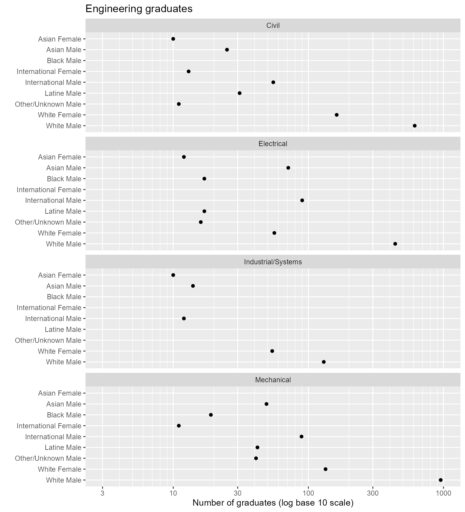
Figure 4. Alphabetical ordering conceals patterns in the data.
Multiway superposition
To illustrate superposing data, we return to the data set with
separate columns for race/ethnicity and sex. Let’s use
graduates as our quantitative variable and omit unnecessary
variables.
# Select multiway variables with a superposed category
DT_count <- copy(DT)
# DT_count <- DT_count[, .(program, race, sex, graduates)]
DT_count
#>        program               people          race    sex ever_enrolled
#>         <char>               <char>        <char> <char>         <int>
#>  1:      Civil         Asian Female         Asian Female            15
#>  2:      Civil International Female International Female            23
#>  3:      Civil         White Female         White Female           263
#> ---
#> 27: Mechanical   International Male International   Male           178
#> 28: Mechanical   Other/Unknown Male Other/Unknown   Male            80
#> 29: Mechanical           White Male         White   Male          1596
#>     graduates stickiness
#>         <int>      <num>
#>  1:        10       66.7
#>  2:        13       56.5
#>  3:       162       61.6
#> ---
#> 27:        89       50.0
#> 28:        41       51.2
#> 29:       955       59.8
The superposed category is sex. The multiway data to be
conditioned are graduates, the quantitative variable, and
program and race, the two categorical
variables.
# Convert categories to factors ordered by median
DT_count <- order_multiway(DT_count,
  quantity = "graduates",
  categories = c("program", "race")
)
DT_count
#>        program               people          race    sex ever_enrolled
#>         <fctr>               <char>        <fctr> <char>         <int>
#>  1:      Civil         Asian Female         Asian Female            15
#>  2:      Civil International Female International Female            23
#>  3:      Civil         White Female         White Female           263
#> ---
#> 27: Mechanical   International Male International   Male           178
#> 28: Mechanical   Other/Unknown Male Other/Unknown   Male            80
#> 29: Mechanical           White Male         White   Male          1596
#>     graduates stickiness program_median race_median
#>         <num>      <num>          <num>       <num>
#>  1:        10       66.7           28.0          14
#>  2:        13       56.5           28.0          34
#>  3:       162       61.6           28.0         148
#> ---
#> 27:        89       50.0           45.5          34
#> 28:        41       51.2           45.5          16
#> 29:       955       59.8           45.5         148
In this example, program and race are
factors, ordered by median number of graduates while sex
remains an unordered character variable.
Using conventional ggplot syntax, the aesthetics include
x and y as before. We superpose data markers
for sex in rows by assigning color = sex inside the
aes() function.
# Race/ethnicity encoded by rows, sex superposed
ggplot(DT_count, aes(x = graduates, y = race, color = sex)) +
  facet_wrap(vars(program), ncol = 1, as.table = FALSE) +
  geom_vline(aes(xintercept = program_median), linetype = 2, color = ref_line_color) +
  common_scale_x_log10 +
  common_labs +
  geom_point(size = 2) +
  scale_color_manual(values = c("#004488", "#DDAA33"))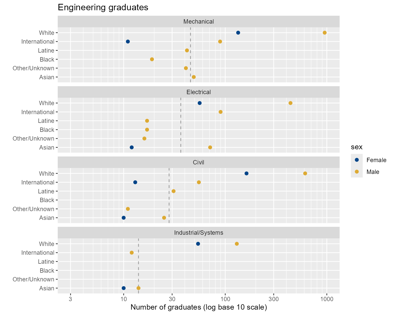
Figure 5. Using superposition to display three categories.
By superposing data by sex, we facilitate a direct comparison of
Male and Female students within a program and by race.
Swapping rows and panels yields the next chart, in which we can directly compare Male and Female students within their race/ethnicity category across programs. Because men tend to outnumber women in engineering programs, this chart clearly shows clusters by sex.
# Program encoded by rows, sex superposed
ggplot(DT_count, aes(x = graduates, y = program, color = sex)) +
  facet_wrap(vars(race), ncol = 1, as.table = FALSE) +
  geom_vline(aes(xintercept = race_median), linetype = 2, color = ref_line_color) +
  common_scale_x_log10 +
  common_labs +
  geom_point(size = 2) +
  scale_color_manual(values = c("#004488", "#DDAA33"))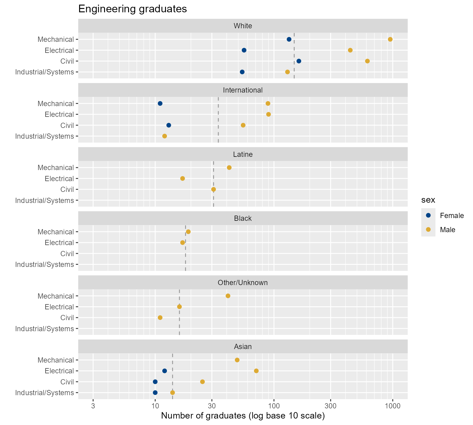
Figure 6. Switching the row and column assignments of two categorical variables.
Percentage-ordered data
For persistence metrics such as stickiness or graduation rate, the
quantitative variable is a ratio or percentage. Here, we return to the
original case study results and select stickiness
(stickiness) as the quantitative variable.
# Select multiway variables when quantity is a percentage
DT_ratio <- copy(DT)
# DT_ratio[, c("race", "sex") := NULL]
DT_ratio
#>        program               people          race    sex ever_enrolled
#>         <char>               <char>        <char> <char>         <int>
#>  1:      Civil         Asian Female         Asian Female            15
#>  2:      Civil International Female International Female            23
#>  3:      Civil         White Female         White Female           263
#> ---
#> 27: Mechanical   International Male International   Male           178
#> 28: Mechanical   Other/Unknown Male Other/Unknown   Male            80
#> 29: Mechanical           White Male         White   Male          1596
#>     graduates stickiness
#>         <int>      <num>
#>  1:        10       66.7
#>  2:        13       56.5
#>  3:       162       61.6
#> ---
#> 27:        89       50.0
#> 28:        41       51.2
#> 29:       955       59.8
Because stickiness is a ratio, we set method to
“percent” and assign graduates and
ever_enrolled to the ratio_of argument.
order_multiway() then sums the ever_enrolled
and graduates counts by category and produces grouped
percentages to order the category levels.
# Convert categories to factors ordered by group percentages
DT_ratio <- order_multiway(DT_ratio,
  quantity = "stickiness",
  categories = c("program", "people"),
  method = "percent",
  ratio_of = c("graduates", "ever_enrolled")
)
DT_ratio
#>        program               people          race    sex ever_enrolled
#>         <fctr>               <fctr>        <char> <char>         <num>
#>  1:      Civil         Asian Female         Asian Female            15
#>  2:      Civil International Female International Female            23
#>  3:      Civil         White Female         White Female           263
#> ---
#> 27: Mechanical   International Male International   Male           178
#> 28: Mechanical   Other/Unknown Male Other/Unknown   Male            80
#> 29: Mechanical           White Male         White   Male          1596
#>     graduates stickiness program_stickiness people_stickiness
#>         <num>      <num>              <num>             <num>
#>  1:        10       66.7               62.5              62.7
#>  2:        13       56.5               62.5              57.1
#>  3:       162       61.6               62.5              60.5
#> ---
#> 27:        89       50.0               59.0              50.0
#> 28:        41       51.2               59.0              45.6
#> 29:       955       59.8               59.0              59.4
The function again converts the categories to factors and adds two
columns (program_stickiness and
people_stickiness) to display the computed percentages used
to order the factors. In the percentage method, the new column names are
a combination of the category variable names (from
categories) plus the quantitative column name (from
x).
For example, the results show that the stickiness of Civil
Engineering (program_stickiness) is 62.5%, and of Asian
Females, 62.7% (people_stickiness). We confirm these
results by computing the group stickiness values independently.
The following values agree with those in the
program_stickiness variable above,
# Verify order_multiway() output
temp <- DT[, lapply(.SD, sum), .SDcols = c("ever_enrolled", "graduates"), by = c("program")]
temp[, stickiness := round(100 * graduates / ever_enrolled, 1)]
temp
#>               program ever_enrolled graduates stickiness
#>                <char>         <int>     <int>      <num>
#> 1:              Civil          1470       919       62.5
#> 2:         Electrical          1437       718       50.0
#> 3: Industrial/Systems           325       220       67.7
#> 4:         Mechanical          2271      1340       59.0
And the next result agrees with the values in
people_stickiness.
# Verify order_multiway() output
temp <- DT[, lapply(.SD, sum), .SDcols = c("ever_enrolled", "graduates"), by = c("people")]
temp[, stickiness := round(100 * graduates / ever_enrolled, 1)]
temp
#>                   people ever_enrolled graduates stickiness
#>                   <char>         <int>     <int>      <num>
#>  1:         Asian Female            51        32       62.7
#>  2: International Female            42        24       57.1
#>  3:         White Female           671       406       60.5
#> ---
#>  7:   Other/Unknown Male           149        68       45.6
#>  8:           White Male          3596      2136       59.4
#>  9:           Black Male            59        36       61.0
Percentage-ordered charts
Here the quantitative variable is group stickiness. The first chart encodes programs by rows and people by panels. Row-order is determined by program stickiness computed over all students; panel order is determined by people stickiness computed over all programs.
The order of rows and panels has changed from the earlier charts.
# Programs encoded by rows
ggplot(DT_ratio, aes(x = stickiness, y = program)) +
  facet_wrap(vars(people), ncol = 1, as.table = FALSE) +
  geom_vline(aes(xintercept = people_stickiness), linetype = 2, color = ref_line_color) +
  labs(x = "Stickiness", y = "", title = "Engineering stickiness") +
  geom_point()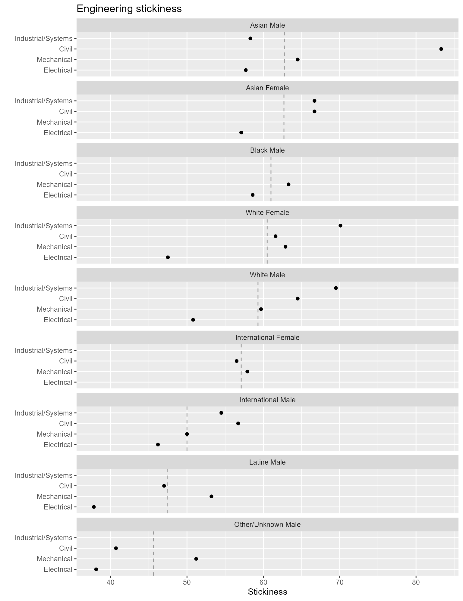
Figure 7. Rows and column ordered by percentages.
The visual asymmetries in this chart that stand out are
- Industrial/Systems, Asian Male, low stickiness given given the program’s overall rank.
- Civil, White Female, low stickiness given the program’s overall rank.
Again, we cannot compare the eight values for a given program as effectively. This is done far better in the second chart that encodes people by rows and programs by panels.
# People encoded by rows
ggplot(DT_ratio, aes(x = stickiness, y = people)) +
  facet_wrap(vars(program), ncol = 1, as.table = FALSE) +
  geom_vline(aes(xintercept = program_stickiness), linetype = 2, color = ref_line_color) +
  labs(x = "Stickiness", y = "", title = "Engineering stickiness") +
  geom_point()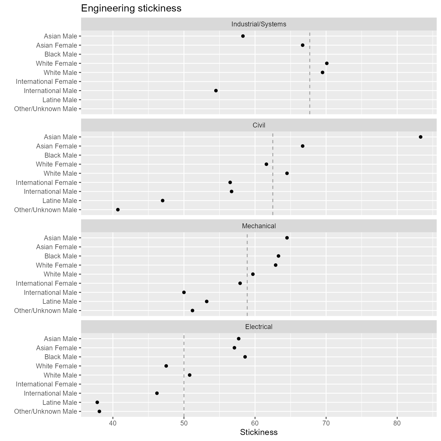
Figure 8. Switching the row and column assignments of categorical variables.
This chart shows a lot of variability. The visual asymmetries
that stand out are
- Asian Female, Mechanical Engineering, high given the group’s overall rank
- Asian Male and Female contrast, Civil
Tabulating counts
Readers and reviewers of charts often want to see the exact numbers represented by data markers. To serve that need, we tabulate multiway data after transforming it from block-record form (convenient for use with ggplot2) to row-record form—that is, from “long” to “wide” form.
To illustrate, let’s tabulate the number of graduates by people and program. Start by selecting the desired variables only.
# Select the desired variables
tbl <- copy(DT)
tbl <- tbl[, .(program, people, graduates)]
tbl
#>        program               people graduates
#>         <char>               <char>     <int>
#>  1:      Civil         Asian Female        10
#>  2:      Civil International Female        13
#>  3:      Civil         White Female       162
#> ---
#> 27: Mechanical   International Male        89
#> 28: Mechanical   Other/Unknown Male        41
#> 29: Mechanical           White Male       955
Use dcast() to transform the block records to row
records.
# Transform shape to row-record form
tbl <- dcast(tbl, people ~ program, value.var = "graduates")
tbl
#> Key: <people>
#>                 people Civil Electrical Industrial/Systems Mechanical
#>                 <char> <int>      <int>              <int>      <int>
#>  1:       Asian Female    10         12                 10         NA
#>  2:         Asian Male    25         71                 14         49
#>  3:         Black Male    NA         17                 NA         19
#> ---
#>  7: Other/Unknown Male    11         16                 NA         41
#>  8:       White Female   162         56                 54        134
#>  9:         White Male   612        439                130        955
Edit one column name and print the table.
# Edit column header
setnames(tbl, old = "people", new = "Group", skip_absent = TRUE)| Group | Civil | Electrical | Industrial/Systems | Mechanical |
|---|---|---|---|---|
| Asian Female | 10 | 12 | 10 | NA |
| Asian Male | 25 | 71 | 14 | 49 |
| Black Male | NA | 17 | NA | 19 |
| Hispanic Male | 31 | 17 | NA | 42 |
| International Female | 13 | NA | NA | 11 |
| International Male | 55 | 90 | 12 | 89 |
| Other/Unknown Male | 11 | 16 | NA | 41 |
| White Female | 162 | 56 | 54 | 134 |
| White Male | 612 | 439 | 130 | 955 |
Multiway data structure lends itself to tables of this type. The levels of one category are in the first column; the levels of the second category are in the table header; and the quantitative variable fills the cells—a response value for each combination of levels of the two categories.
Tabulating percentages
When tabulating percentages, readers and reviewers are likely to want the percentage values as well as the underlying ratios of integers. In this example, we suggest one way these values can be presented in a single table.
# Select the desired variables
tbl <- copy(DT)
tbl <- tbl[, .(program, people, graduates, ever_enrolled, stickiness)]
tbl
#>        program               people graduates ever_enrolled stickiness
#>         <char>               <char>     <int>         <int>      <num>
#>  1:      Civil         Asian Female        10            15       66.7
#>  2:      Civil International Female        13            23       56.5
#>  3:      Civil         White Female       162           263       61.6
#> ---
#> 27: Mechanical   International Male        89           178       50.0
#> 28: Mechanical   Other/Unknown Male        41            80       51.2
#> 29: Mechanical           White Male       955          1596       59.8
In this step, we concatenate a character string with the number of
students ever enrolled in parentheses followed by the percentage
stickiness e.g., (16) 56.2.
# Construct new cell values
tbl[, results := paste0("\u0028", ever_enrolled, "\u0029", "\u00A0", round(stickiness, 1), "%")]
tbl
#>        program               people graduates ever_enrolled stickiness
#>         <char>               <char>     <int>         <int>      <num>
#>  1:      Civil         Asian Female        10            15       66.7
#>  2:      Civil International Female        13            23       56.5
#>  3:      Civil         White Female       162           263       61.6
#> ---
#> 27: Mechanical   International Male        89           178       50.0
#> 28: Mechanical   Other/Unknown Male        41            80       51.2
#> 29: Mechanical           White Male       955          1596       59.8
#>          results
#>           <char>
#>  1:   (15) 66.7%
#>  2:   (23) 56.5%
#>  3:  (263) 61.6%
#> ---
#> 27:    (178) 50%
#> 28:   (80) 51.2%
#> 29: (1596) 59.8%
Now we can perform the transformation from block records to row records as we did above.
# Transform shape to row-record form
tbl <- dcast(tbl, people ~ program, value.var = "results", fill = NA_character_)
tbl
#> Key: <people>
#>                 people       Civil  Electrical Industrial/Systems   Mechanical
#>                 <char>      <char>      <char>             <char>       <char>
#>  1:       Asian Female  (15) 66.7%  (21) 57.1%         (15) 66.7%         <NA>
#>  2:         Asian Male  (30) 83.3% (123) 57.7%         (24) 58.3%   (76) 64.5%
#>  3:         Black Male        <NA>  (29) 58.6%               <NA>   (30) 63.3%
#> ---
#>  7: Other/Unknown Male  (27) 40.7%  (42) 38.1%               <NA>   (80) 51.2%
#>  8:       White Female (263) 61.6% (118) 47.5%         (77) 70.1%  (213) 62.9%
#>  9:         White Male (949) 64.5% (864) 50.8%        (187) 69.5% (1596) 59.8%
Edit one column name and print the table.
# Edit column header
setnames(tbl, old = "people", new = "Group", skip_absent = TRUE)| Group | Civil | Electrical | Industrial/Systems | Mechanical |
|---|---|---|---|---|
| Asian Female | (15) 66.7% | (21) 57.1% | (15) 66.7% | NA |
| Asian Male | (30) 83.3% | (123) 57.7% | (24) 58.3% | (76) 64.5% |
| Black Male | NA | (29) 58.6% | NA | (30) 63.3% |
| Hispanic Male | (66) 47% | (45) 37.8% | NA | (79) 53.2% |
| International Female | (23) 56.5% | NA | NA | (19) 57.9% |
| International Male | (97) 56.7% | (195) 46.2% | (22) 54.5% | (178) 50% |
| Other/Unknown Male | (27) 40.7% | (42) 38.1% | NA | (80) 51.2% |
| White Female | (263) 61.6% | (118) 47.5% | (77) 70.1% | (213) 62.9% |
| White Male | (949) 64.5% | (864) 50.8% | (187) 69.5% | (1596) 59.8% |